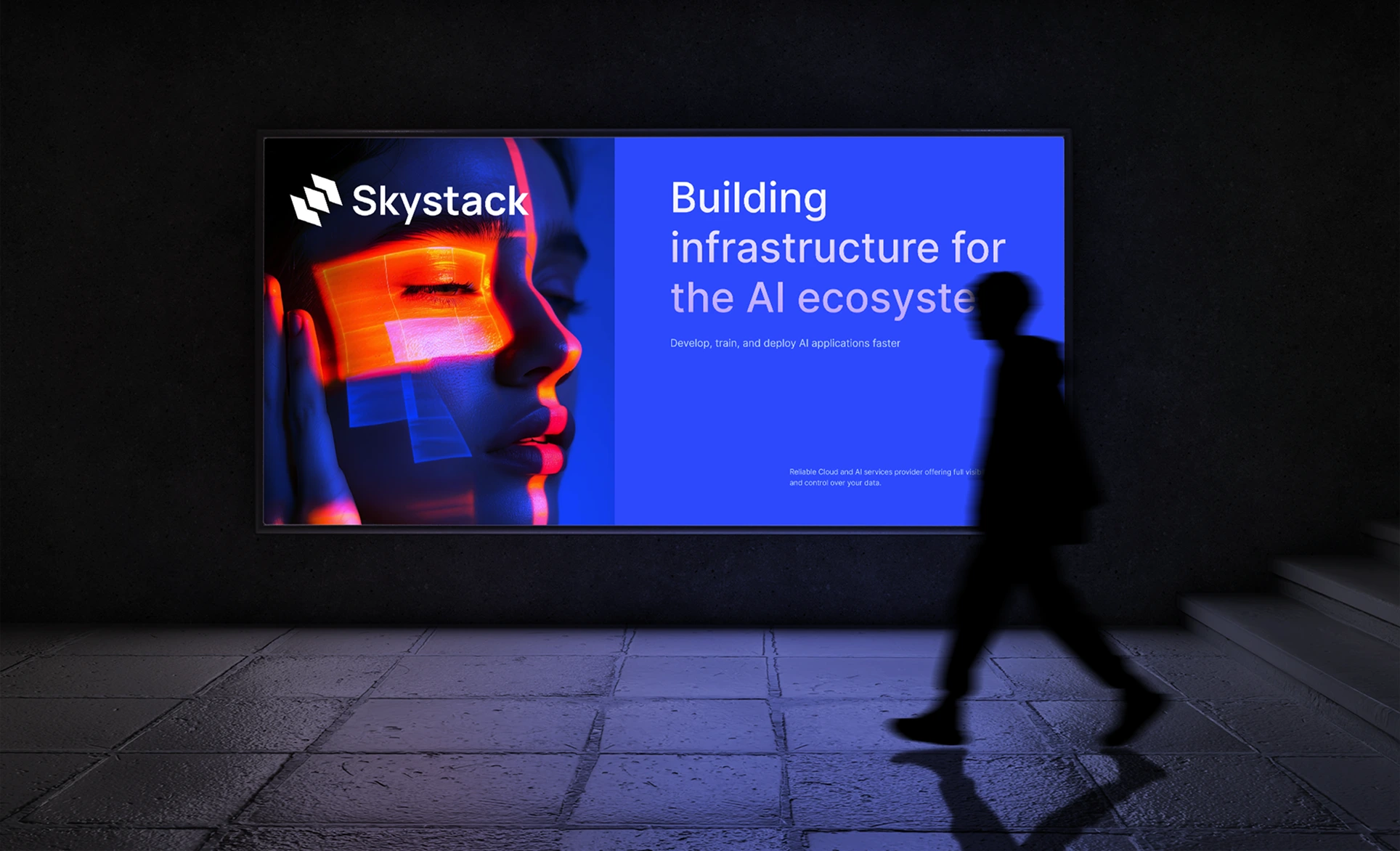
Skystack
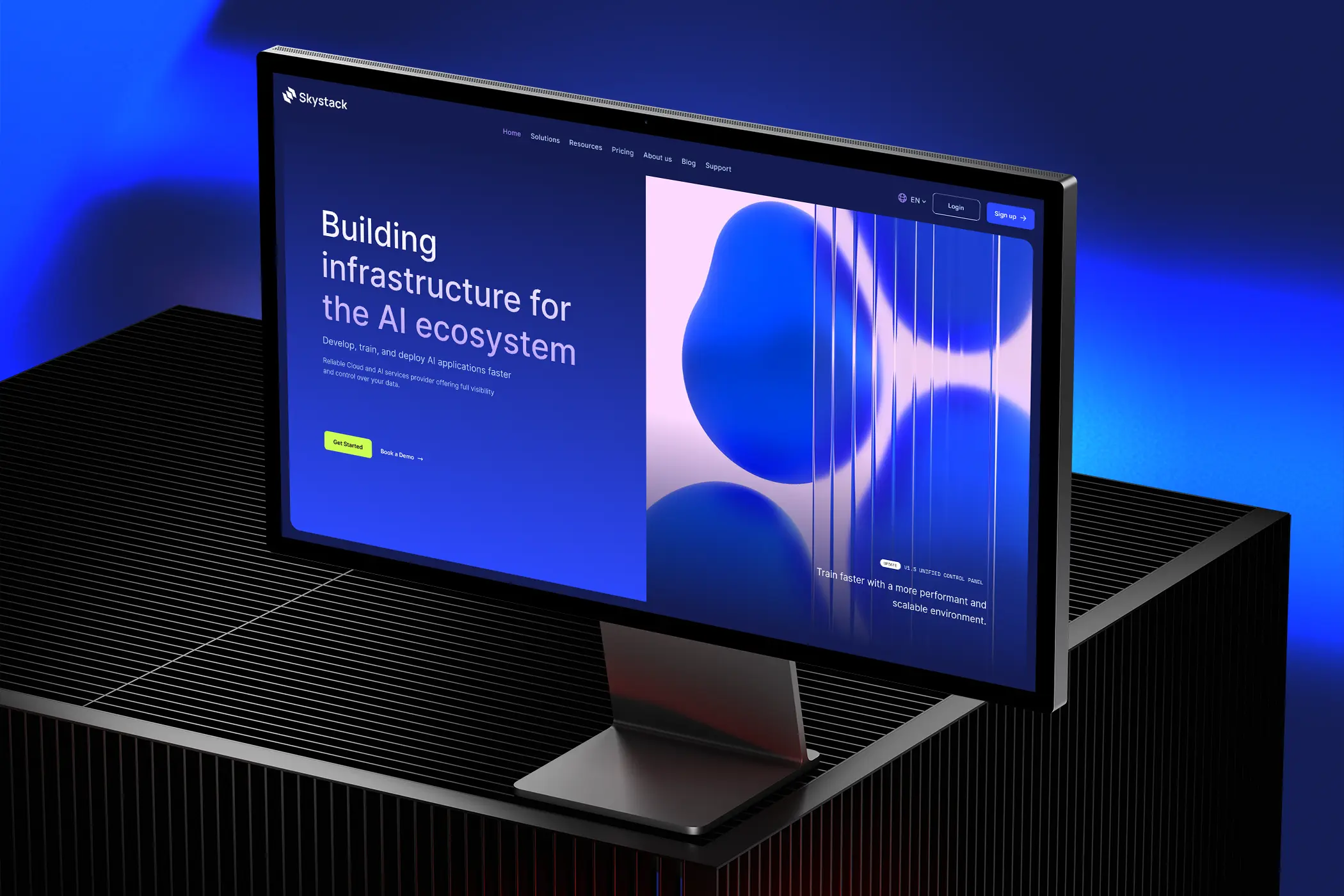
A conceptual web presence for a European cloud platform built for AI businesses, balancing technical credibility with visual clarity across a complex B2B product.
Overview
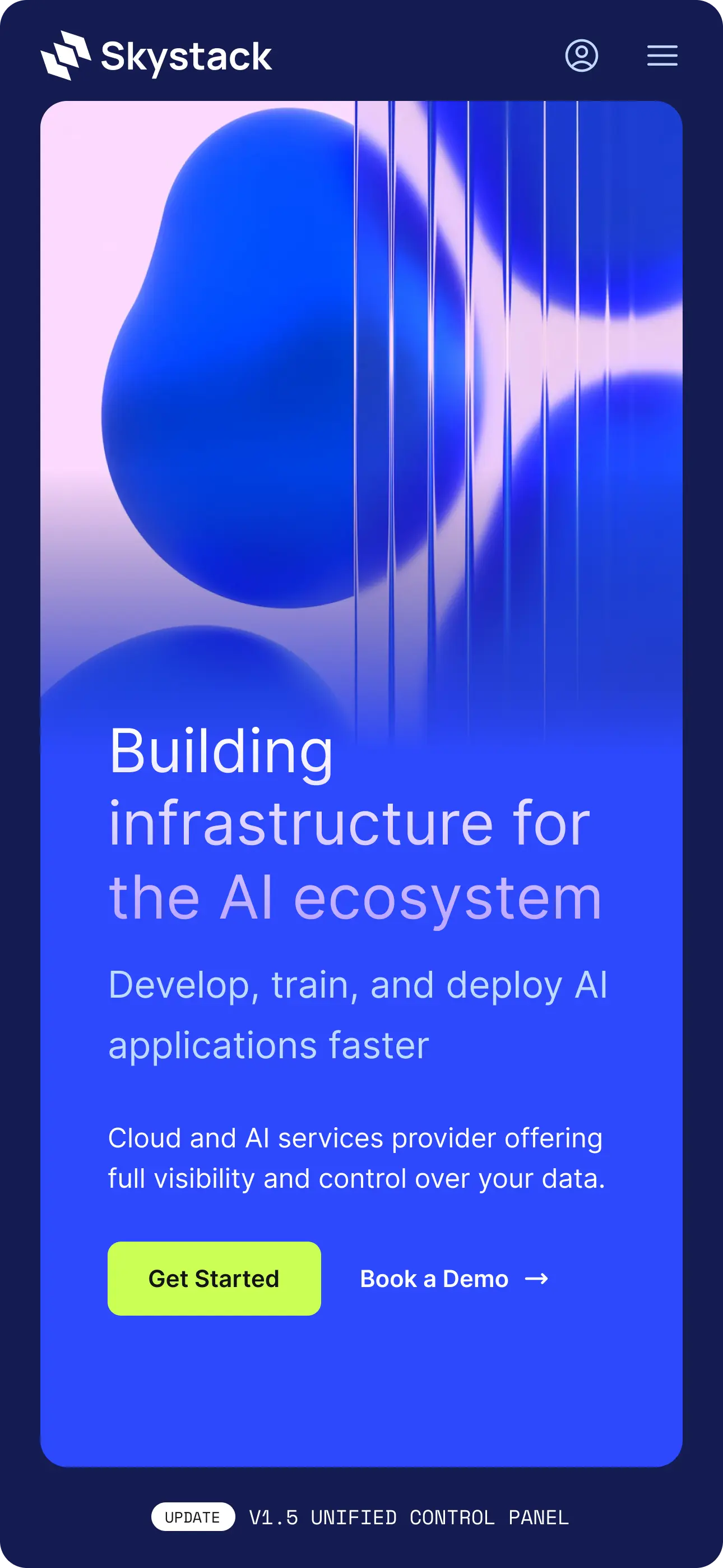
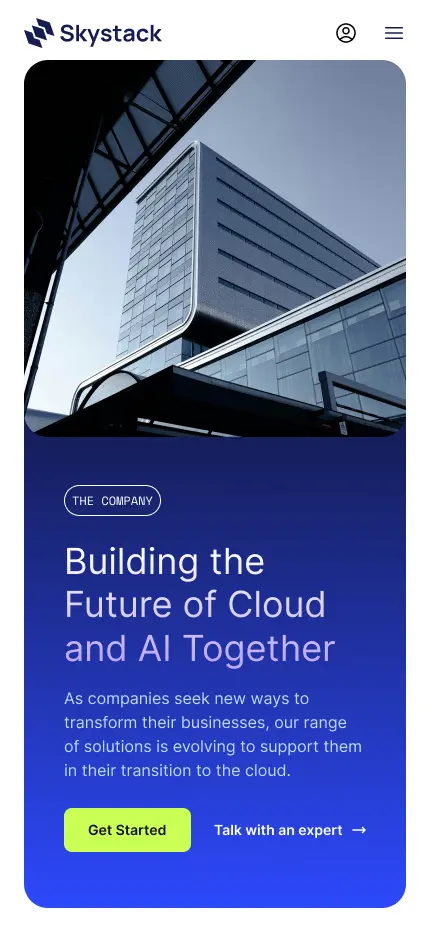
Skystack is a conceptual design system and web presence for a European cloud platform built for AI businesses. The project explores how visual design can carry technical credibility, communicating reliability, performance and innovation to a demanding B2B audience, while grounding the platform’s identity in European data sovereignty.
The platform offers two deeply integrated products: Cloud Services and AI Services. Each targets a distinct user type within the AI ecosystem, from developers and researchers to CTOs and enterprise buyers, making clarity of communication as important as aesthetic quality.
The Challenge
The company offers both Cloud Services and AI Services, two deeply integrated products that needed to be clearly communicated to different user types in the AI ecosystem: developers, CTOs and founders.
As a Visual Designer, my goal was to:
- Create a clean, modern design that reflects technical excellence and aligns with AI and cloud innovation
- Balance aesthetic with information clarity
- Design scalable UI components to support product growth and content expansion
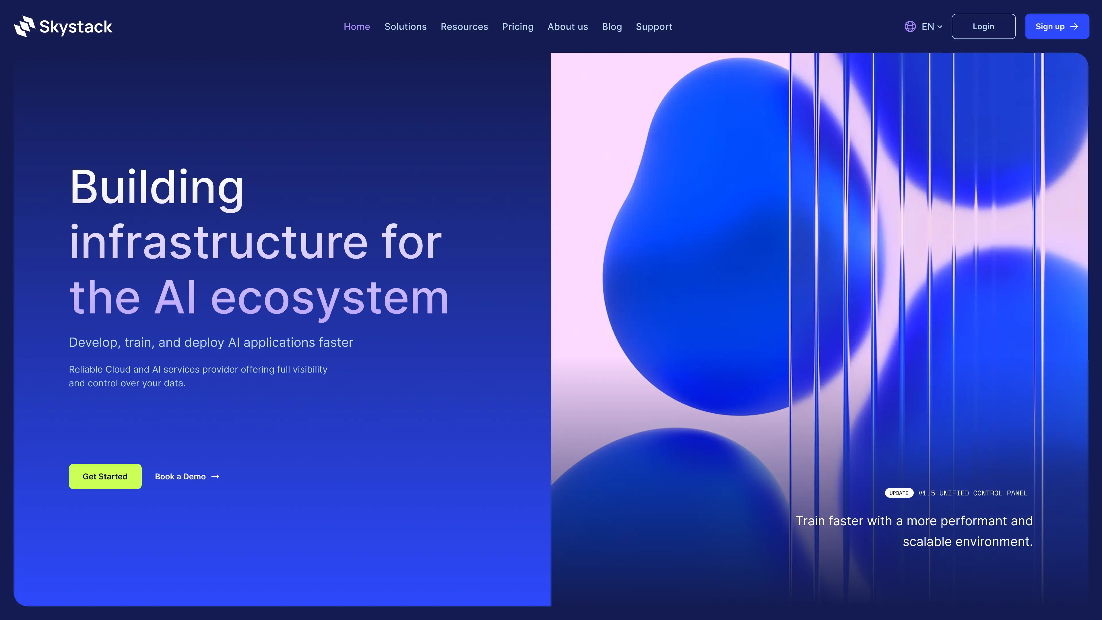
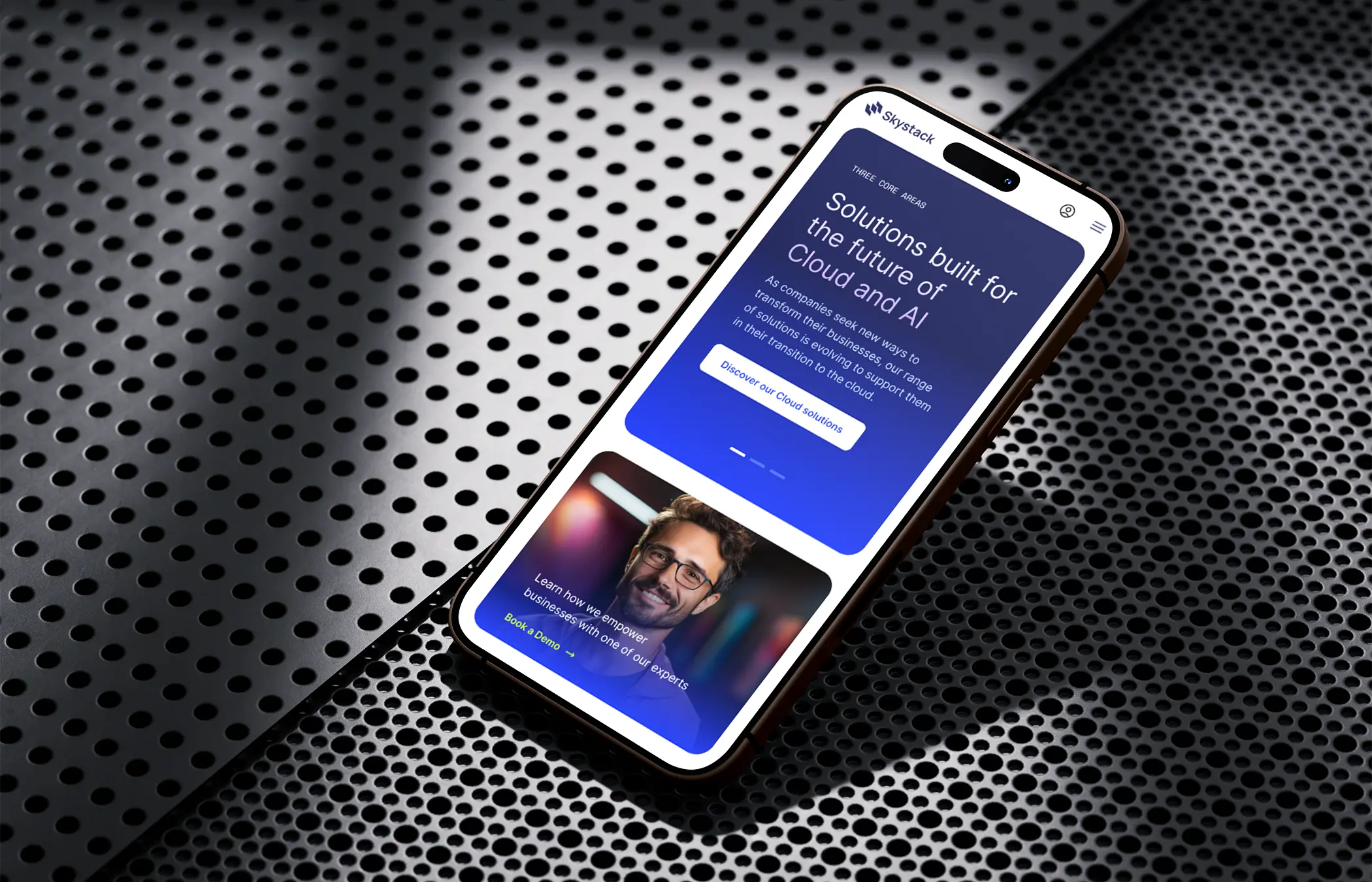
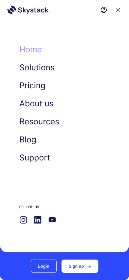
- Design a homepage and core web sections that clearly explain the company’s offering
Discovery & Strategy
Research Focus
- Studied websites from cloud providers such as AWS, Paperspace, Lambda Labs and OVHcloud
- Analyzed AI startups to understand how they communicate complex systems visually
- Identified patterns in B2B SaaS websites: clarity, trust, minimalism, technical credibility
Target Audiences
- Technical founders and CTOs looking for scalable infrastructure
- AI researchers and engineers seeking high-performance infrastructure
- Enterprise buyers evaluating platforms for deployment, compliance and support

Typography
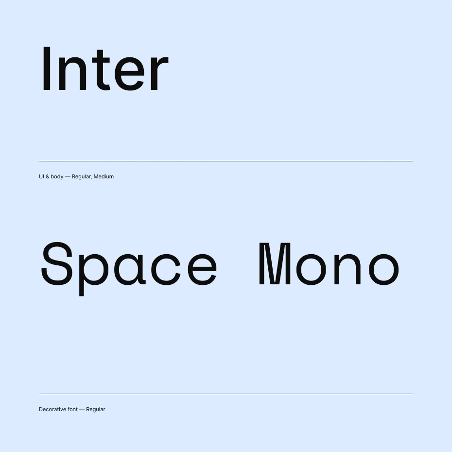
The type system was built around two purposeful choices. Inter handles all UI and body copy. Its screen-native design and neutral clarity make it ideal for dense technical interfaces where legibility under pressure matters. Space Mono brings the accent: a monospaced typeface that nods to the terminal and codebase, used decoratively to signal technical credibility without overpowering the interface.
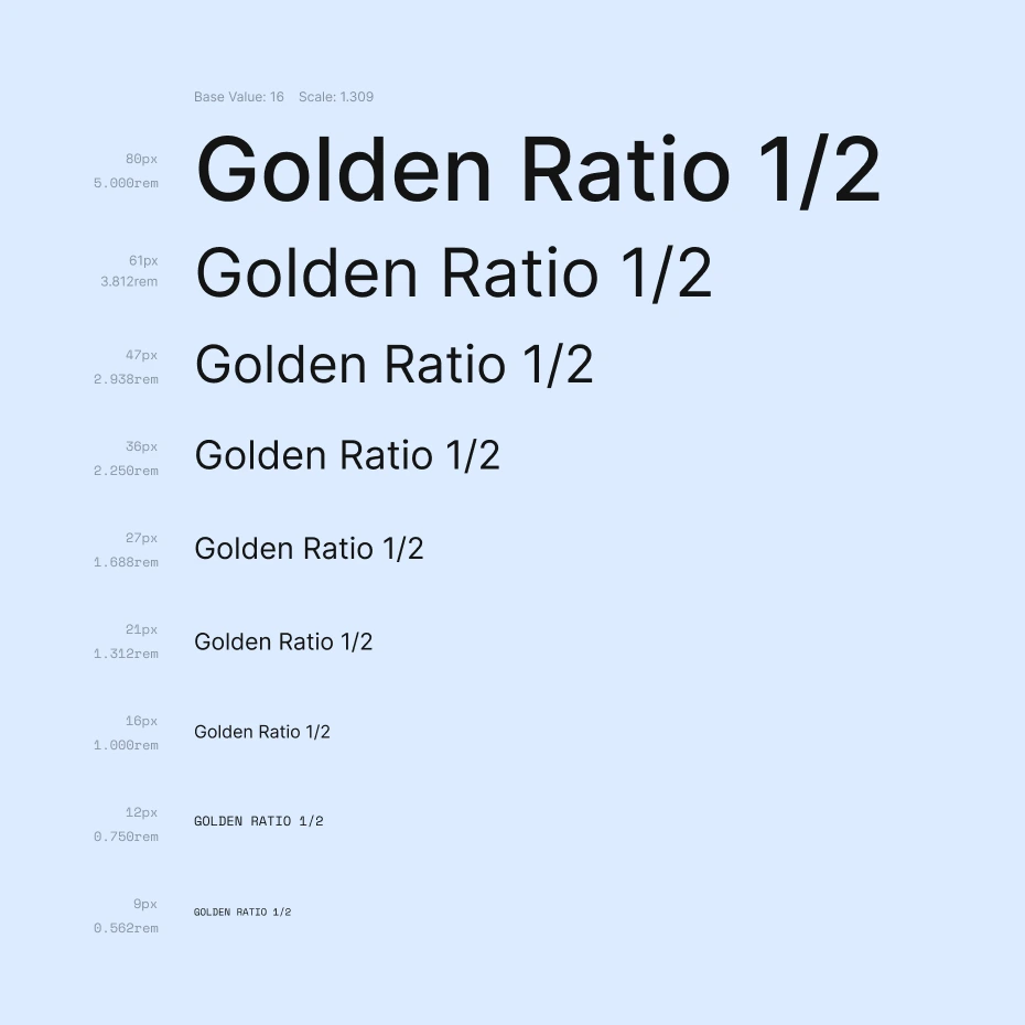
The scale follows a golden ratio progression (1.309) anchored at 16px, producing nine harmonious steps from 9px labels up to 80px display headings.
The brand
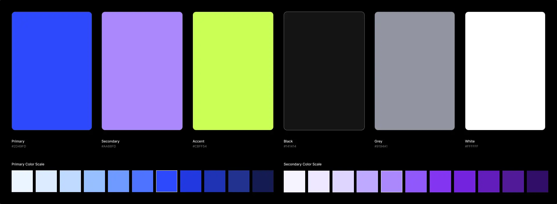
Skystack’s visual identity makes a deliberate bet on confidence. The primary blue (#2D49FD) is electric, not corporate. The secondary lavender adds depth, and the yellow-green accent (#CBFF54) cuts through both with maximum contrast, reserved almost exclusively for calls-to-action, which makes every button feel intentional.
The logo mark, stacked geometric layers, directly references the product: infrastructure built in layers, scalable by design. It reads clearly in white on the primary blue and in blue on light backgrounds, giving the brand flexibility across contexts.
Outcome
Skystack gave me a real opportunity to practice one of the harder skills in product design: taking a high volume of technical information and making it feel approachable without oversimplifying it. Cloud infrastructure, AI services, compliance, data sovereignty — there is a lot to communicate, and the design had to carry it clearly without becoming a wall of text or a generic feature list.