Orleans
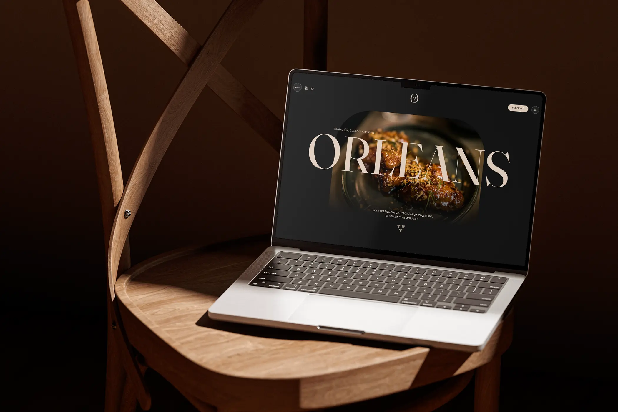
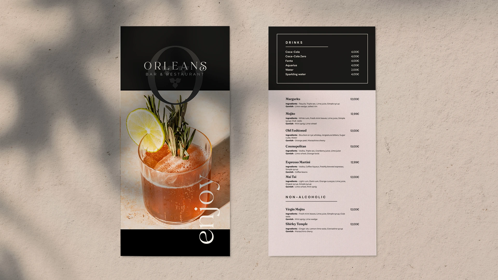
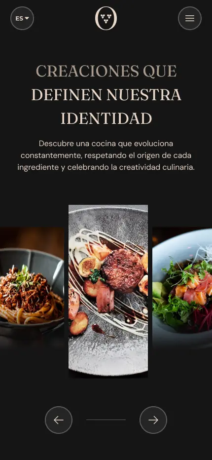
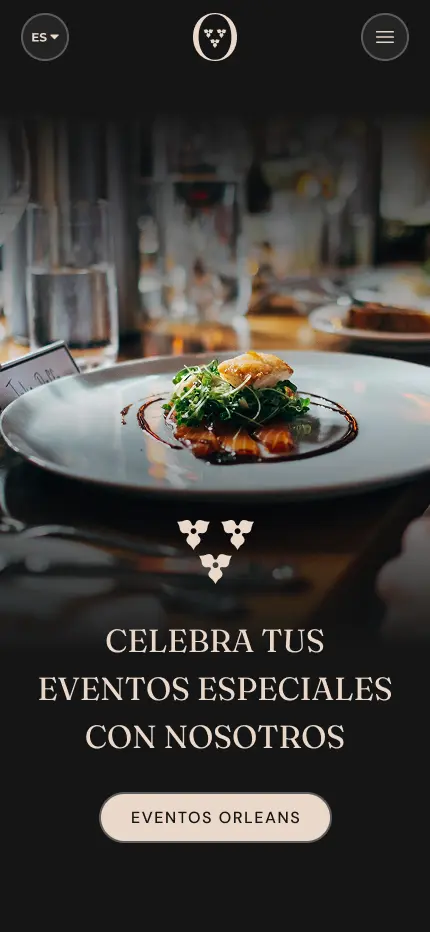
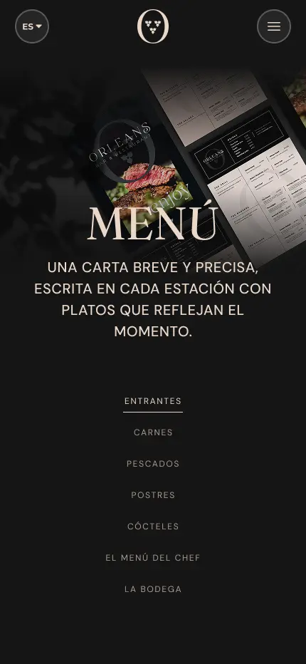
Orleans is a restaurant focused on delivering a refined, high-end dining experience. The goal of this project was to design a website that reflects the restaurant’s elegance and culinary excellence, while providing a seamless and intuitive user experience.
Overview
Orleans is a restaurant focused on delivering a refined, high-end dining experience. This project explores how visual design can communicate elegance, culinary excellence and warmth through a digital presence that feels as considered as the dining experience itself.
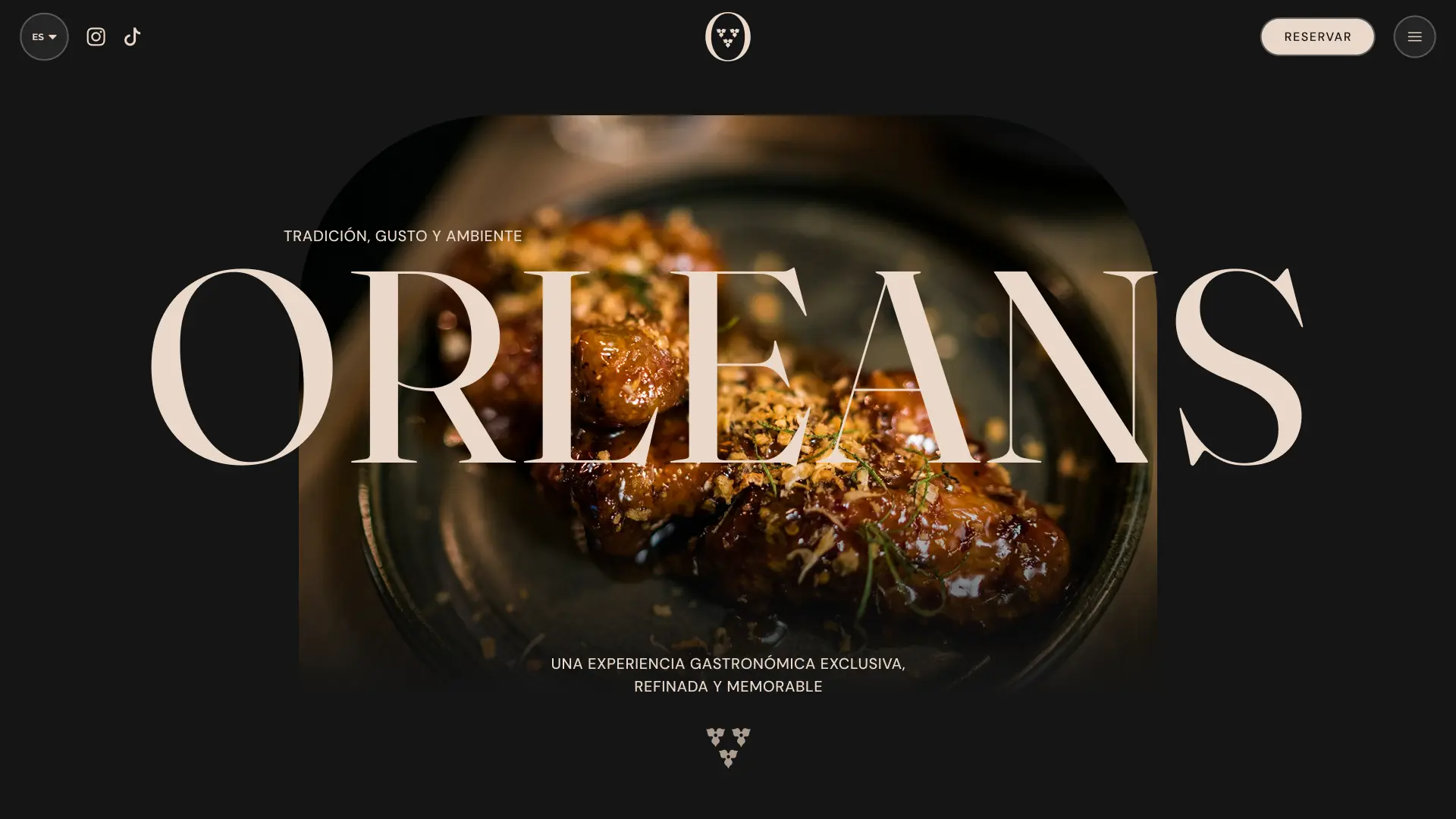
The goal was to design a website that reflects the restaurant’s identity with clarity and intention, guiding visitors seamlessly from discovery to reservation while leaving a lasting impression of quality.
The Challenge
Most restaurant websites fall into one of two traps: they are either too generic, relying on stock photography and template layouts that could belong to any dining establishment, or they overload the visitor with menus, events and promotions before they have had a chance to feel anything.
For a high-end restaurant like Orleans, the digital experience needs to do what great hospitality does in person: make the guest feel something before they have even arrived.
As a Visual Designer, my goal was to:
- Design a visual identity that communicates refinement and culinary excellence
- Create a layout that prioritises atmosphere and feeling over information density
- Build a clear path from discovery to reservation with as little friction as possible
- Establish a consistent brand language across every touchpoint of the digital experience
Discovery & Strategy
Research Focus
Studying high-end restaurant and hospitality websites revealed consistent patterns worth emulating and pitfalls worth avoiding:
- Strong editorial photography used as the primary brand language
- Minimal navigation that keeps the focus on atmosphere
- Reservation flows integrated early and prominently
- Typography that carries personality and sets the tone before content is read
Target Audiences
- Diners seeking a special occasion venue: need to feel the experience before committing to a booking
- Food enthusiasts and critics: need to understand the culinary identity and chef philosophy
- Returning guests: need fast access to reservations and menu updates
Typography
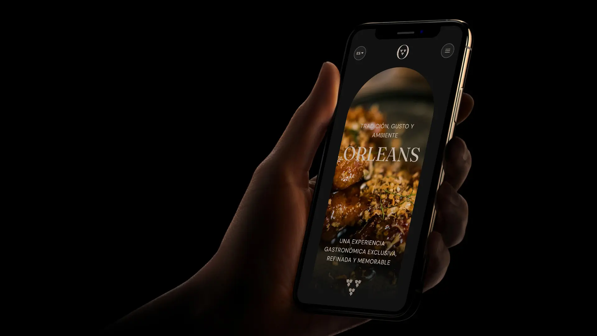
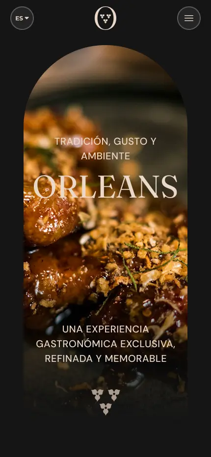
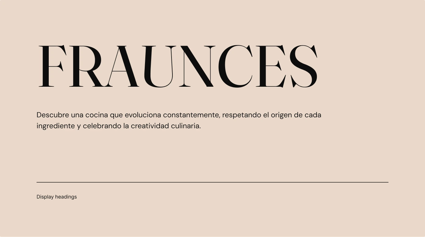
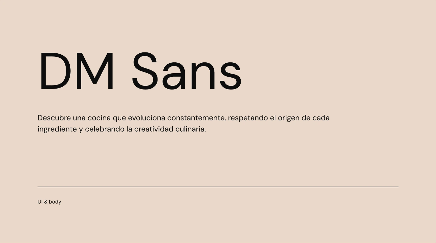
Orleans uses a considered pairing of two typefaces that each carry a distinct role. Fraunces leads at display sizes — an optical serif with warmth, character and a slight vintage quality that communicates refinement without feeling stiff. It sets the emotional tone of the brand at a glance, the way a well-chosen typeface in a physical menu would. DM Sans handles everything else: UI labels, body copy, navigation. Its clean, neutral geometry contrasts with Fraunces without competing, keeping the interface functional and easy to read.
Together they create a balance that feels right for a high-end dining experience: personality where it matters, clarity where it is needed.
The brand
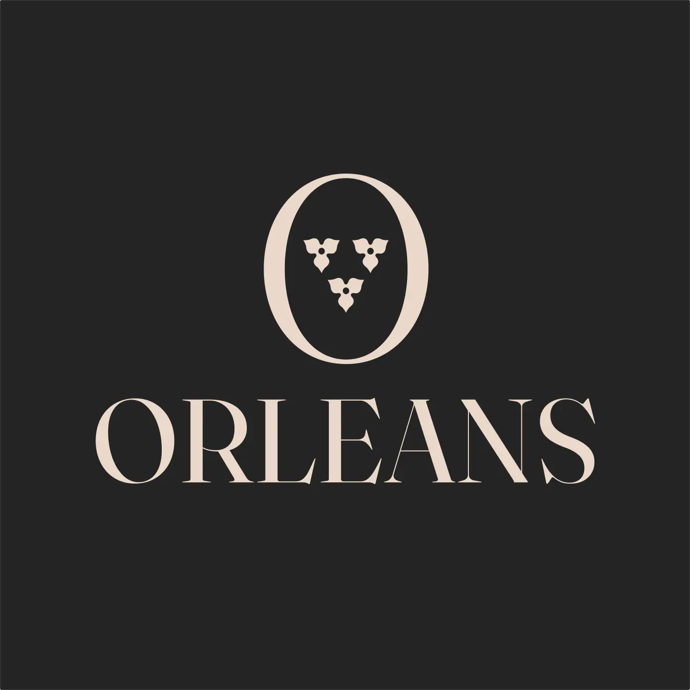
The Orleans logo draws directly from the coat of arms of the city of Orléans, embedding three fleurs-de-lis within the letter O. It is a mark with genuine meaning behind it: the fleur-de-lis carries centuries of French heritage, nobility and culinary tradition, all condensed into a single letterform. The reference is specific enough to feel intentional, and restrained enough to feel elegant rather than decorative.
This kind of logo works because it earns its confidence. It does not need to explain itself. Guests who recognise the heraldic reference understand immediately what kind of place Orleans is. Those who do not still feel the weight and care of the mark, even if they cannot name why.
Outcome
Orleans was genuinely good practice for a more refined, editorial approach to design. Working on this design pushed me to slow down and be more deliberate with every decision, from how much whitespace to leave to how a typeface choice changes the mood of a whole page.
It also made me think more carefully about restraint. In this kind of project, less really does communicate more. The temptation to fill space or add visual complexity is always there, but sometimes the work gets better every time you resist it.