Sungrid
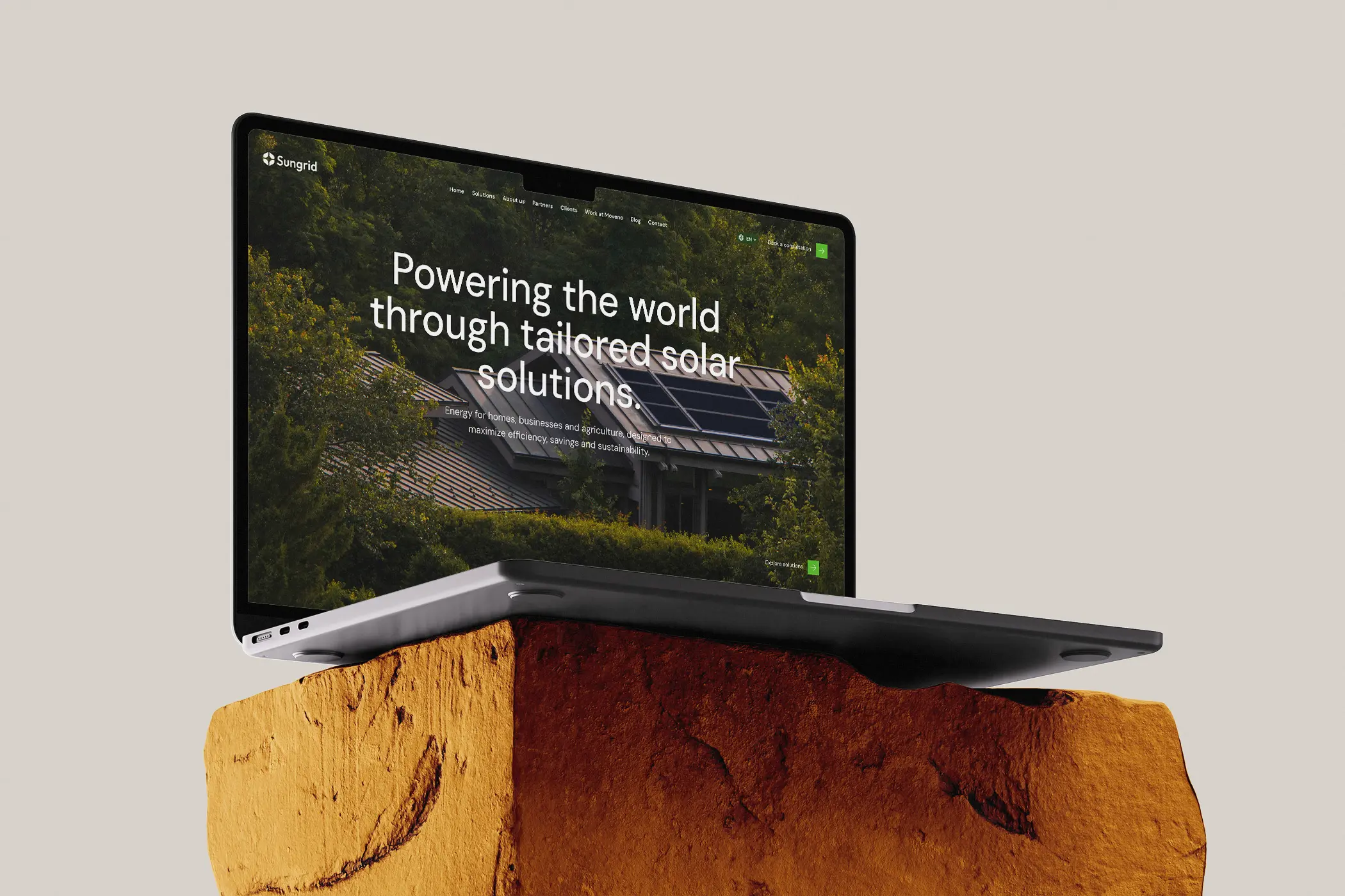
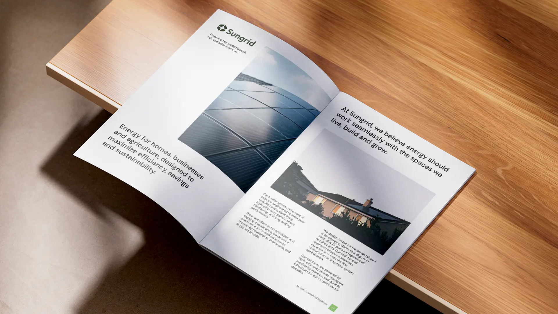
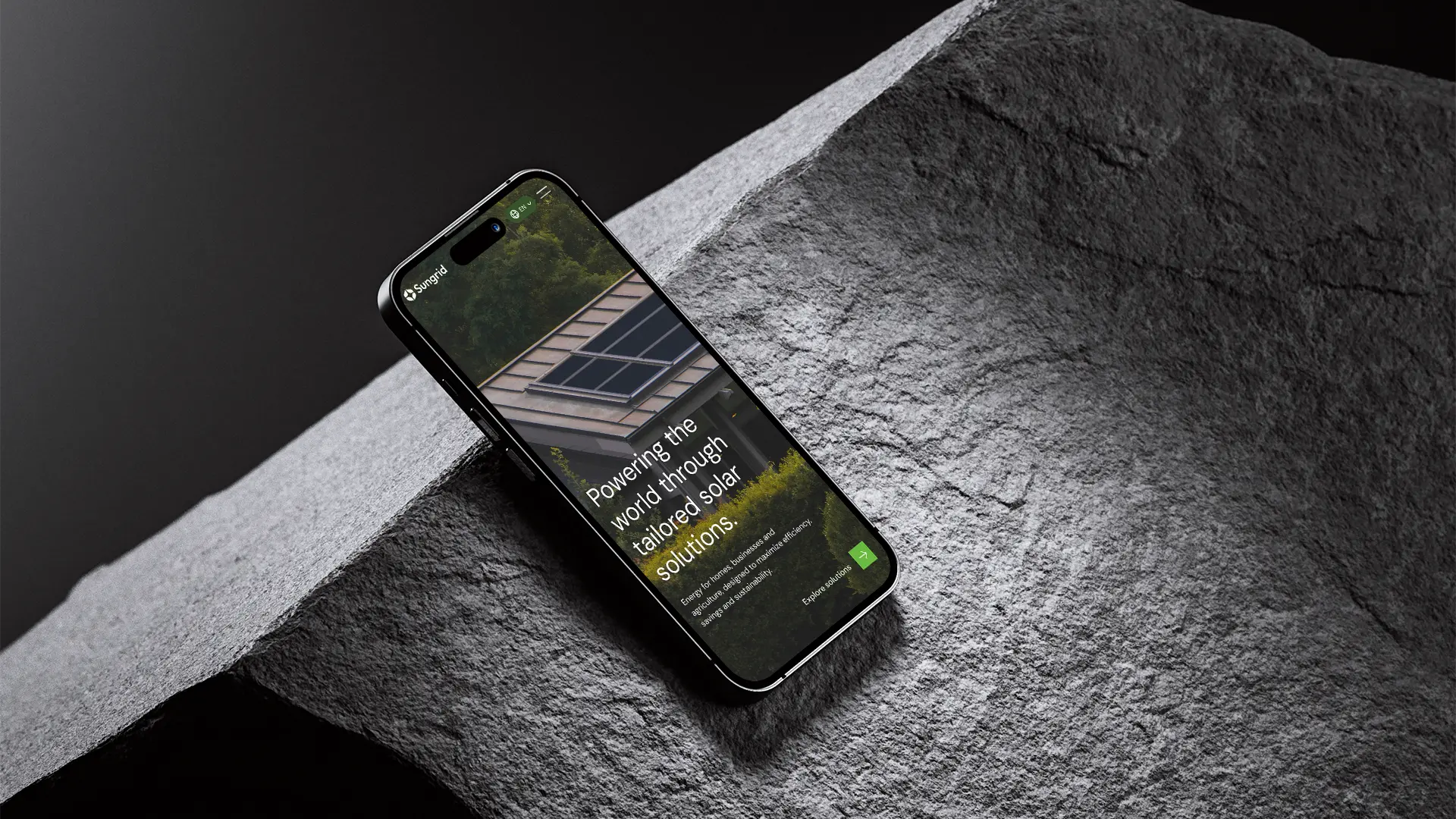
Brand identity and website design for a solar energy company serving households, enterprises and the agricultural sector, turning a complex service offering into a clear, trustworthy and future-focused digital experience.
Overview
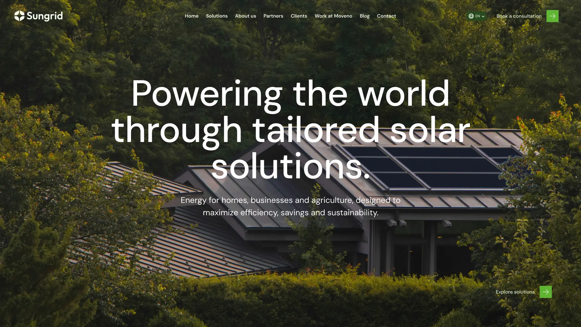
This project explores the design of a modern corporate website for a solar energy company that serves households, enterprises and the agricultural sector. The goal was to design a cohesive, future-focused brand and a multi-page website experience that communicates clarity, innovation and trust while guiding different customer segments toward solutions tailored to their needs.
The Challenge
Solar companies often present fragmented information, overly technical jargon, and poor segmentation for different user types. This makes it difficult for visitors to understand offerings, evaluate benefits, and trust the brand.
How can a digital platform communicate a complex service in a simple, modern, and trustworthy way across all audience types — from homeowners to corporate investors?
As a Visual Designer, my goal was to:
- Create a cohesive brand experience across all digital touchpoints
- Establish a clear information architecture tailored to multiple audience segments
- Build a design system that feels innovative, trustworthy, clean, and scalable
- Highlight the company’s strengths through data, technology, and results
- Offer an intuitive journey that drives users toward solutions, quotes, or consultations
- Represent company transparency through investor-focused content
Discovery & Strategy
Research Focus:
The analysis of top solar companies revealed recurring issues:
-
Confusing navigation structures
-
Heavy technical explanations without context
-
Weak brand storytelling
-
Lack of trust indicators or social proof
-
A one-size-fits-all approach to solar solutions
Target Audiences:
- Homeowners Motivations: lower costs, independence, sustainability Needs: simple explanations, benefits, cost clarity
- Enterprise Decision-Makers Motivations: operational efficiency, ESG goals, ROI Needs: data, scalability, long-term reliability
- Agricultural Operators Motivations: durability, system resilience, predictable energy supply Needs: practical solutions, financial incentives, proven performance
- Investors Motivations: transparency, growth potential, market positioning Needs: clear numbers, milestones, strategic vision
Typography
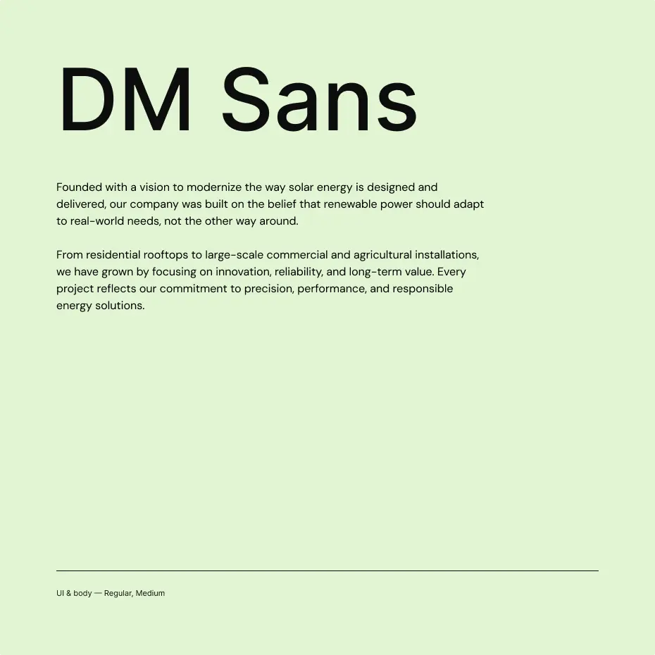
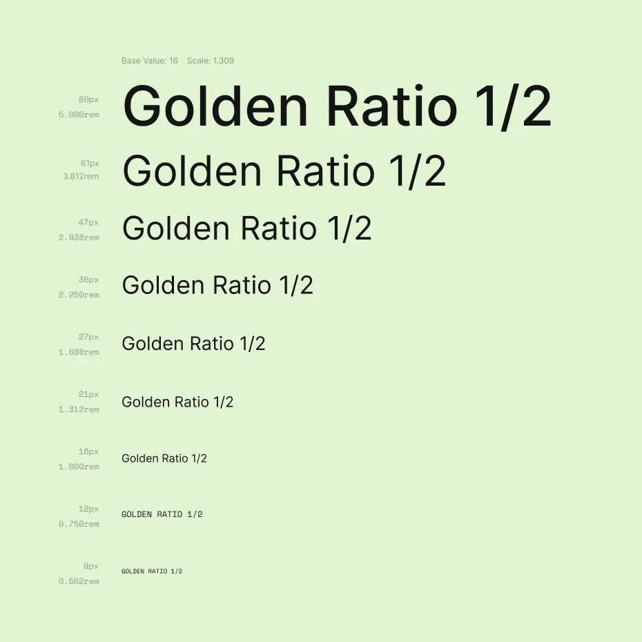
Sungrid uses a single typeface throughout: DM Sans. The choice reflects the brand’s tone, approachable, clean and modern, without the cold sterility that heavier geometric fonts can carry. A single family keeps the system tight and ensures nothing competes for attention when the hierarchy needs to do its work.
The scale follows the golden ratio progression (1.309) anchored at 16px, producing nine harmonious steps from 9px labels up to 80px display headings. Consistent spacing between steps means every size level reads as clearly distinct, giving the layout a sense of order that communicates professionalism without feeling rigid.
The brand
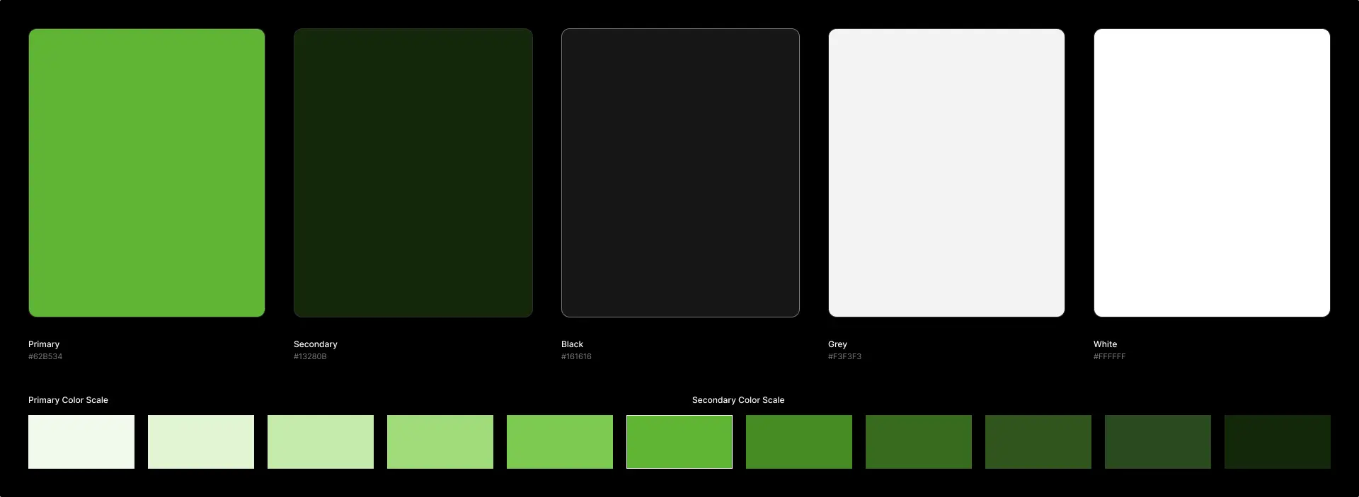
Sungrid’s identity is rooted entirely in green, and that is a deliberate statement. Rather than using colour as decoration, the palette makes the brand’s values immediately legible: fresh, natural, and forward-looking. The primary green is vibrant without being aggressive, and the dark forest variant grounds the identity when a more serious tone is needed.
The logo mark does two things at once. The four curved segments arranged around a central point read as a solar compass, referencing precision and orientation, but the organic, leaf-like shapes of each segment anchor the brand in nature rather than technology. The mark also resembles a close-up of a solar panel cell. It is a mark that bridges both worlds without forcing the connection, which is exactly what a solar energy company needs to communicate.
Outcome
The hardest part of this project was that the website needed to work for very different people at the same time. A homeowner and a corporate investor are looking for completely different things, and the design had to make both of them feel like the site was built for them.
What I took away from this is that structure matters a lot. Once I had a clear sense of who needed what and where, the visual decisions became much easier. It also reminded me that simple, clear communication is harder to achieve than it looks, especially when the subject is technical.