Sushidomo
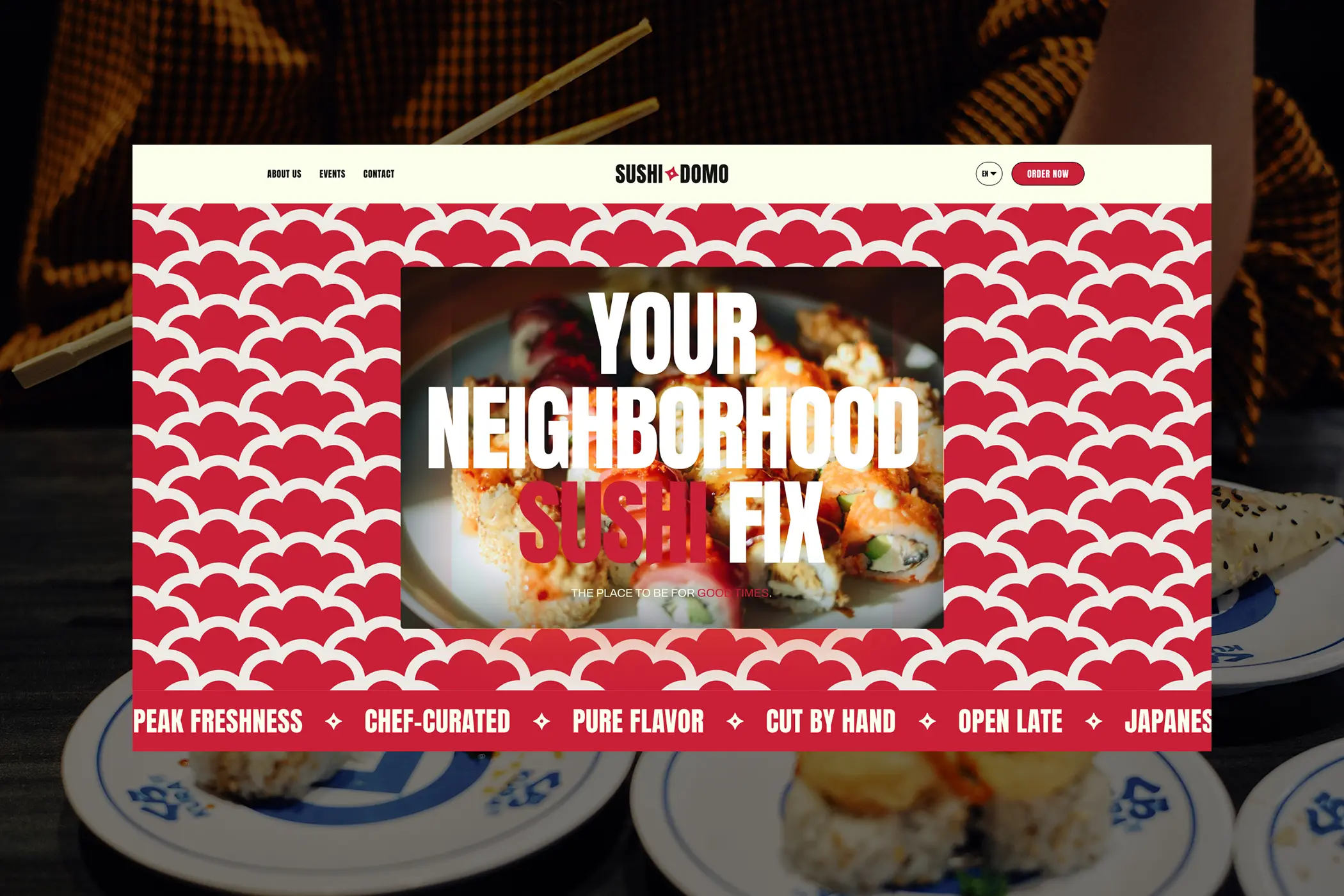
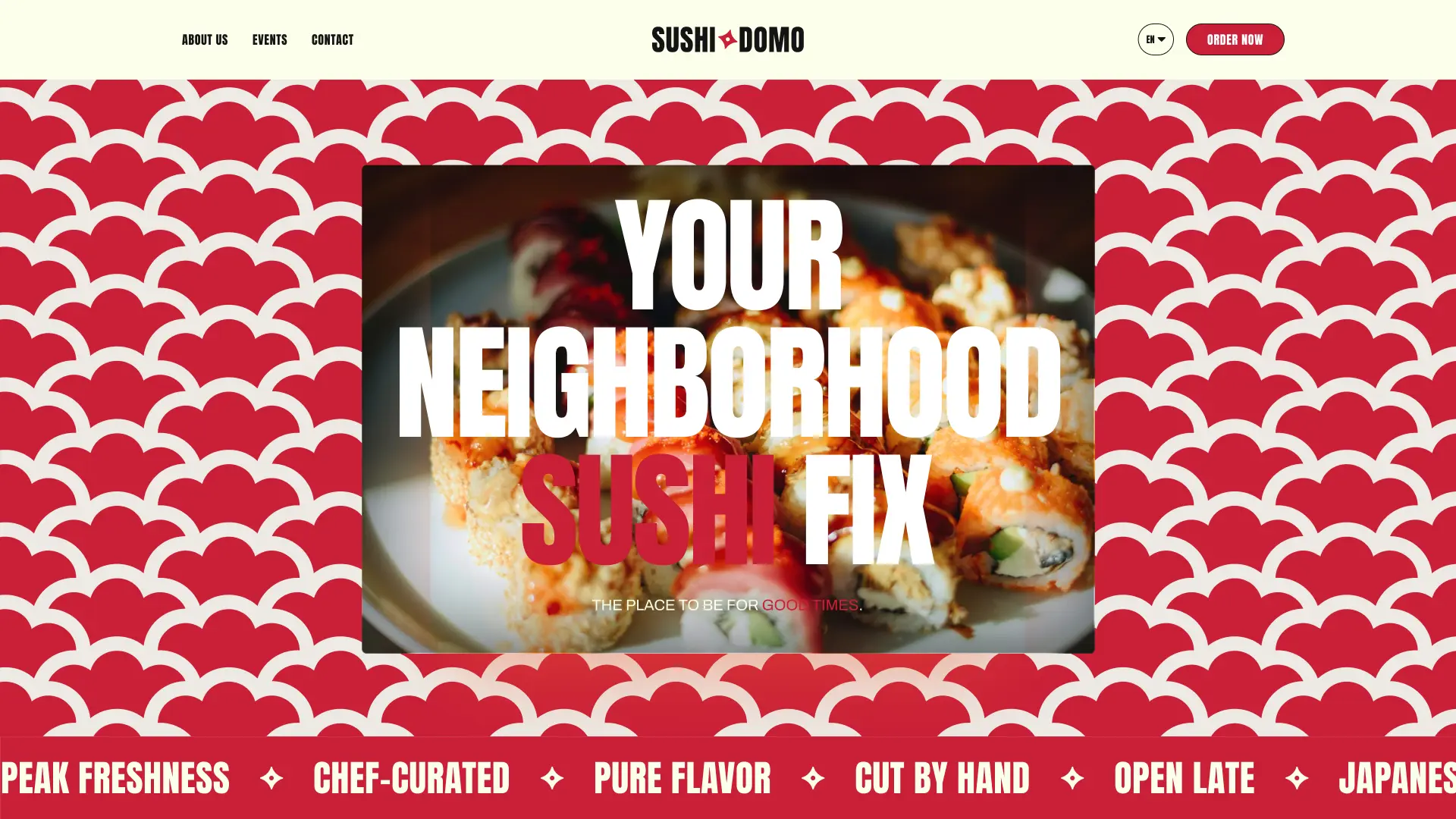
Brand identity and website design for a modern sushi restaurant that blends traditional Japanese culinary techniques with a bold, contemporary visual language, approachable in feel, distinctive in character.
Overview
Sushidomo is a modern sushi restaurant that brings the techniques and refined taste of Japanese cuisine into contemporary creations. The brand needed to feel bold and distinctive while remaining approachable, bridging the precision of Japanese culinary tradition with a visual language that speaks to a modern audience.
The goal was to design a brand identity and website that captures that balance: rooted in Japanese culture and craft, but delivered with energy and confidence.
The Challenge
Sushi restaurants face a very specific visual trap: they either lean into generic Japanese aesthetics, cherry blossoms, red and black palettes, lantern motifs, and end up looking like every other place on the block, or they go so modern that they lose any sense of cultural identity altogether.
Sushidomo needed to avoid both. The challenge was to find a visual language that honours Japanese craft and tradition while feeling genuinely bold and contemporary, not like a pastiche of either direction.
As a Visual Designer, my goal was to:
- Build a brand identity with a strong personality that stands out in a crowded market
- Reference Japanese culture with intention
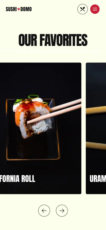
- Design a website that communicates food quality and craftsmanship visually
- Keep the experience approachable and easy to navigate without losing character
Discovery & Strategy
Research Focus
Looking at how modern Japanese restaurant brands communicate revealed a clear gap between the old-guard traditional aesthetic and the new wave of bold, confident brands:
- Contemporary Japanese brands like Ichiran and Genki Sushi use strong graphic identity systems
- The most memorable sushi brands own a colour or a typographic voice, not just a cuisine
- Food-forward imagery works best when paired with a confident layout, not just placed on a white background
- Cultural references land better when they are reinterpreted rather than replicated
Target Audiences
- Urban food lovers looking for quality sushi in a relaxed, modern setting
- Young diners drawn to bold, visually distinctive restaurants they want to share
- Regular customers who order frequently and need a fast, clear menu and ordering experience
Typography
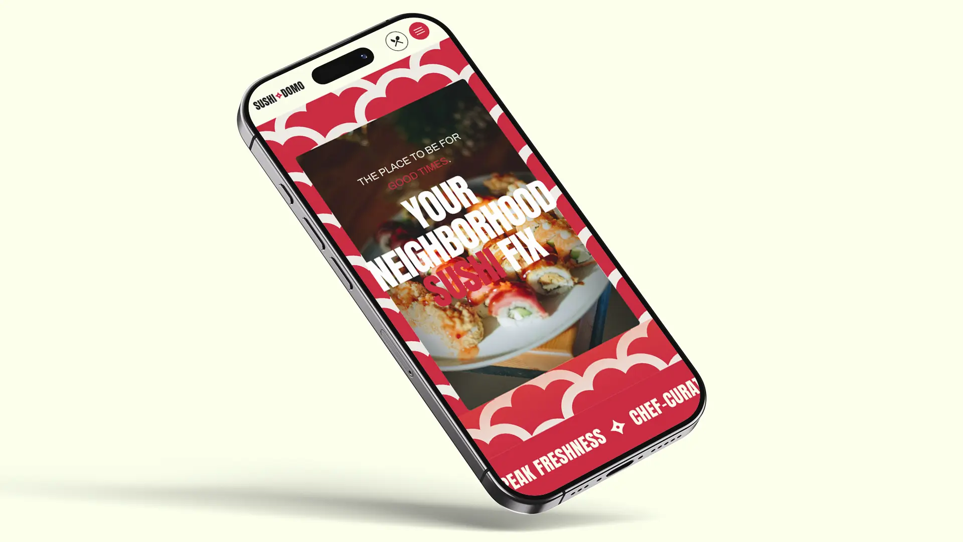
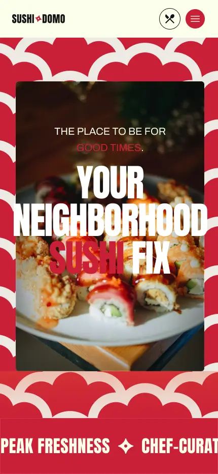
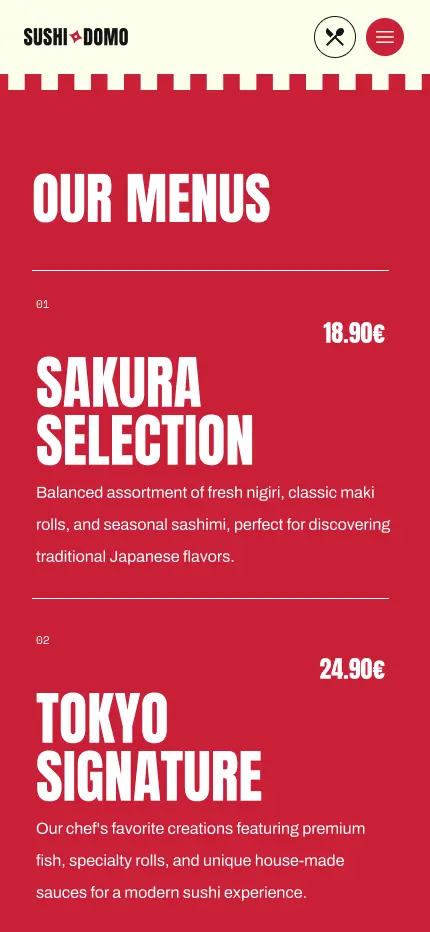
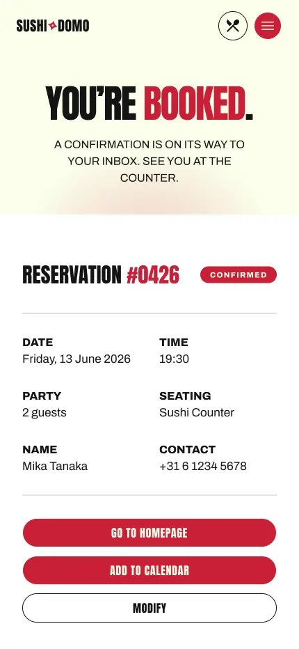
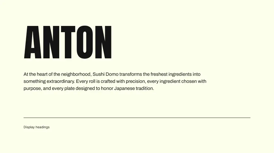
Sushidomo uses Anton for all display and headline use. It is a condensed, heavy typeface with the presence of a poster and the energy of a street sign, bold enough to own the page but compact enough to stay out of the way of the food. The choice is deliberate, Anton gives the brand an immediate personality that does not rely on colour or illustration to be noticed.
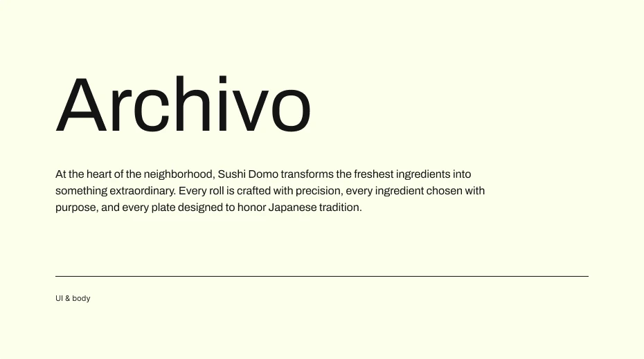
Archivo handles the rest. It is a clean, versatile grotesque that works equally well in paragraphs, menu listings and body copy without demanding attention.
The brand
The name carries two layers. Sushi is the obvious one. Domo, meaning house, positions the restaurant as a home for sushi rather than just a place that serves it. Between the two words sits a shuriken, a detail that nods to Japanese culture in a way that is playful and confident. It works because it fits the spirit of the brand perfectly: bold, a little unexpected, and not taking itself too seriously.
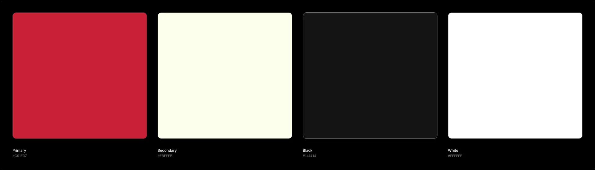
The colour palette draws from Japanese visual culture but applies it with warmth. The goal was a brand that feels familiar from the first visit, the kind of place you go on a regular Saturday and still feel good about recommending.
Outcome
Sushidomo was a good exercise in building a design with personality. It is easy to design something that looks nice and neutral, much harder to design something that feels like a specific place with a specific character. The shuriken in the wordmark, the typeface choice, the colour decisions, each one had to pull in the same direction to make the brand feel cohesive rather than just decorated.